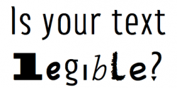
Can your customers read your content?

When designing your website, one of the most important, but overlooked decisions is what font to use. The typography used within your site has the ability to draw your readers in or turn them away at first glance.
When working with the typography on your website it is important to remember the end goal: to help your readers find, understand, and connect with the words, ideas, and information they seek. If your readers are not connecting with your words, then they will have a hard time connecting with you and your business.
Although there is a countless number of factors to consider when it comes to your website’s typography, there is one crucial thing we will focus on today, and that is choosing a legible font.
One thing you can be sure of when it comes to typography, is if something is hard to read, the chances of people actually reading it is excruciatingly slim. For this reason I will highlight the top factors to consider when choosing legible font.
Generous x height
Although this phrase sounds like a secret code, it is actually plain and simple. You want to look at the height of the lower case ‘x’ within a font and choose one that has a more generous height. Why? Great question. This is because the x height correlates with the spaces between letters (called counter-form space). Font with generous x height is easier to read.

Generous apertures
I know, I know. Foreign language again. Bare with me! The term ‘aperture’ refers to the opening in letters like c, a, and e. Choosing a font with generous apertures creates more visible space.

Slightly looser letter spacing
This is pretty explanatory. This is referring to the space in between letters. You want to choose a font that has enough space to easily recognize the words, but not so much space that your readers are thrown off.

Generous Bowl Shape
This is referring to the roundness in letters like d and o. Like the other characteristics we have mentioned, you want to find a balance. You want to choose a font with generous bowl shape, but also want to avoid choosing a font that has ‘too round’ of a bowl shape.

Prominent Ascenders and descenders
Ascenders are the strokes that extend above the baseline (like with a d or an h) and descenders are the strokes that extend below the baseline (like with a g or a y). You want to look for font types that have longer ascenders or descenders as this will help in the legibility of the words.

Generous strokes
A healthy stroke is one of the most important things when picking your font. Like most characteristics, you want a good and healthy balance. You don’t want to choose a stroke that is too thin and hard to read, but then you don’t want a stroke that is so thick you get lost in the letters. When evaluating the strokes of a font, ask yourself what it is you are trying to convey, and what you are using the lettering for. Are you trying to make a statement? Are you going to use this font in a chunk of text?

Serif vs Sans serif and the common misconception
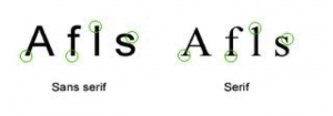
If you are just starting to dive into the realm of typography, you will quickly learn the difference between serif and sans serif. Serif is the text that has the feet on the end of each letter, and san serif is without the feet. Serif is typically seen as more traditional and conservative, where sans serif is seen as more modern and contemporary.
A common misconception within typography is the idea that serif should always be the body text and sans serif should always be the headline. This is not always true. The characteristics listed above are far more important when selecting your font type than simply serif vs. sans serif.

This article was meant to be a brief overview for any novice looking to choose a legible font type for their website. Feel free to comment with any questions or any tips and trick you have learned yourself that could be beneficial for any beginning reader.
Interested in learning how Branded Innovation can help you and your website? Contact us.

